Tuesday, February 12, 2013
Texture Layers, Opacity & Blending Modes
First I exported both pictures from Lightroom to Photoshop. Then I copied the texture picture and pasted it on the picture of the shoes. I changed the opacity to 27% and selected blending mode normal. The texture overlay adds a feeling of oldness to the picture and makes it look more vintage.
Tuesday, February 5, 2013
Text With Layer Blending Modes
First I opened photoshop and added a gradient background. I used normal mode, linear gradient, in the purple/pink color. Then I typed the word "meow" in the font poplar std, size 190 pt, in the color maroon. After, I used the warp text tool and added the fisheye effect and bent it +67%. Next I used the drop shadow tool in the blend mode linear burn, opacity 87%, angle -143. Then i used the inner shadow post with blend mode multiply, opacity 75%, angle -143. After I used the pattern overlay tool with blend mode normal and opacity 24%. Next I used the bevel and emboss tool with the contour inner bevel, depth 171%, in the down direction. Finally, I used the stroke tool in the size 4 px, outside position, blend mode normal, and fill type color.
Thursday, January 31, 2013
Chrysanthemum Color Change Project
This is the before picture.
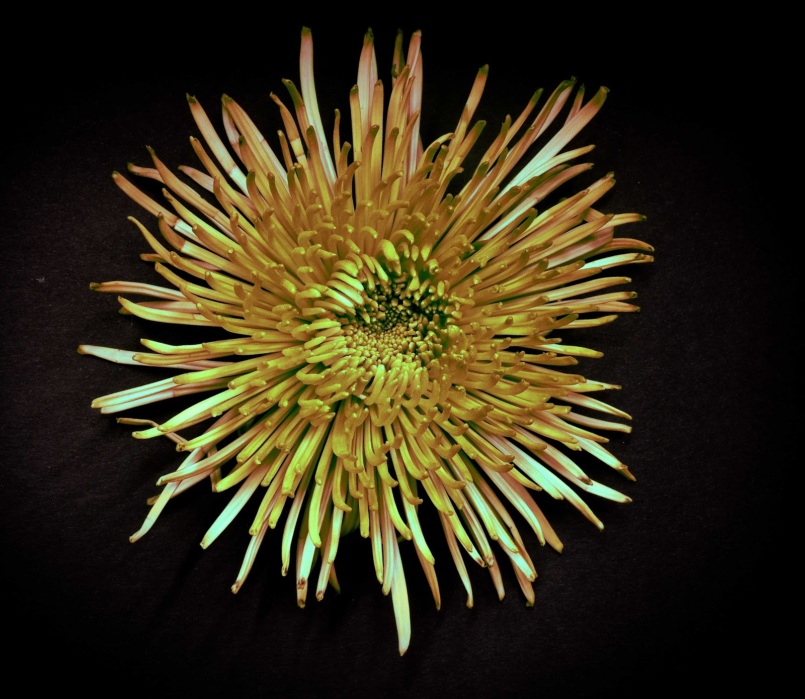
First I opened the picture in photoshop and created a new layer. Then I used color range to select just the flower. After, I slid the fuzziness slider to get the best detail while keeping the background black. Then I used color balance to adjust the colors in the shadows, midtones, and highlights to make the flower yellow. Then I went to Image > Mode > 8/bit. And finally I went to Filter Gallery > Distort > Diffuse Glow.
Thursday, January 17, 2013
Macro Lens Flower Project
I used a macro lens to take these pictures. I also put drops of saline on the petals to look like water drops. Then I used the clone stamp tool in photoshop because the saline left white marks on the petals. After that, I cropped the pictures down to 4X7. I opened a new document and used guide lines to help me place the pictures in the correct places. I put two vertically at .5 in and 6.5 in. Then I put two horizontally at .5 in and 4.5 in.
Tuesday, January 8, 2013
Semester 1 Final
This is the before picture.
This is the after picture. I converted it to black and white, increased the contrast, made it brighter, and changed the blacks. Then I burned the light in the middle to make it a little bit darker. I also used lens vignetting to make the corners darker.
This is the before picture.
This is the after picture. I converted it to black and white, made it brighter, and increased the contrast.
This is the before picture.
This is the after picture. I converted it to black and white, increased the contrast, made the blacks blacker, and increased the sharpness. I also used lens vignetting to make the corners a little bit darker.
This is the before picture.
This the after picture. I converted it to black ad white, increased the contrast, and increased the sharpness. Then I used the clone stamp tool in photoshop to erase the arms and legs because it looked to much like a creepy doll. Also, I cropped out the bottom.
This is the after picture. I converted it to black and white, increased the contrast, made it brighter, and changed the blacks. Then I burned the light in the middle to make it a little bit darker. I also used lens vignetting to make the corners darker.
This is the before picture.
This is the after picture. I converted it to black and white, made it brighter, and increased the contrast.
This is the before picture.
This is the after picture. I converted it to black and white, increased the contrast, made the blacks blacker, and increased the sharpness. I also used lens vignetting to make the corners a little bit darker.
This is the before picture.
This the after picture. I converted it to black ad white, increased the contrast, and increased the sharpness. Then I used the clone stamp tool in photoshop to erase the arms and legs because it looked to much like a creepy doll. Also, I cropped out the bottom.
Tuesday, December 18, 2012
Burning & Dodging Tutorial
I used the burning tool to darken the sky. I used a brush with a master diameter of 288 px and I used 16% exposure on the highlights. I used the dodging tool to lighten the rocks. I used a brush with a master diameter of 813 px and I used 9% exposure on the midtones.
Subscribe to:
Posts (Atom)


